VN Reader Preferences - An Empirical Analysis
Introduction
Hey, this is Arsym, lead programmer for The Sekimeiya: Spun Glass. It's hard to believe, but it's been 6 months since the beta was released. To celebrate, we're publishing a statistical analysis of user preferences and game interactions. My hope is that other developers will use this information to create better games in the future, and to scratch an itch any curious readers might have.
To give context for these results, it's important to understand what the game is about. The Sekimeiya is a mystery visual novel that encourages the player to think and theorize throughout the journey. To help with this, players are given tools such as the ability to search previously read text and take notes. Depending on reading speed, the story typically takes 30-50 hours, but it's possible to go on longer depending on how much time is spent theorizing. The game is presented in NVL mode where text covers the entire screen.
With that out of the way, let's begin!
Spoiler warning: Spoilers are kept to a minimum, but the number of chapters and side endings in the game are shared as a matter of course. Plot points are NOT discussed in any form.
Method
The following data is collected from players:
- A unique ID that's generated when the game is first launched to allow tracking over multiple play sessions
- Game progress (which scenes they've read)
- Play time (in-game time, idle time, time on special screens, time to complete each chapter)
- User preferences
- Choices in the end-game quiz and post-game surveys
- Game version, game platform, and country-level location
No other identifying data is collected, nor is any individual data shared. Aggregated, anonymous data can be seen and visualized by anyone that completes the game in a post-game "Stats" screen. Players are informed of this in a privacy policy on the main menu.
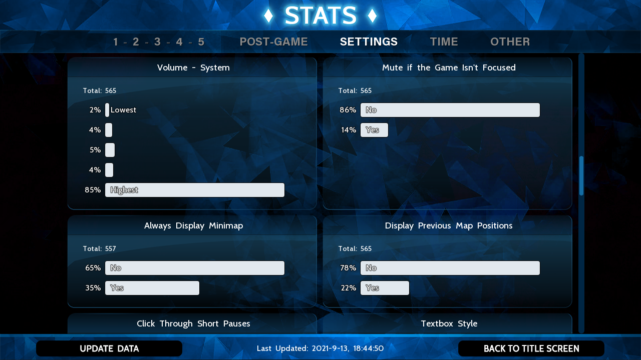
Stats screen that players can access after completing the game
Reporting Frequency
Data is sent to the server when the player reaches a new scene, or when the preferences are changed. This gap in reporting may result in data not being up to date, which we'll see in section titled "Player Retention". In any case, scene changes are dense enough that an update is sent every 30-60 minutes depending on reading speed.
Limitations
- Players have the ability to play offline. If they do, information about game progress may not be complete, and some may have completed the game unknown to us.
- This is not a random sample of VN readers. It is a sample of mystery VN readers. It's possible these results may not apply to other genres.
- UI variables are not randomized, so the default values will dominate many of the results. The game was made to be enjoyable, not experimental, so we didn't (intentionally) subject people to the worst combination of settings. In any case, some variables show significant deviation from the default, implying strong user preference.
- Having so many settings means they need to be explained clearly, especially when many of them are not standard. It's likely many people didn't understand what some settings do, so there's going to be noise in the data when people toggle a setting not knowing what it does.
Results and Discussion
Data was analyzed from a sample of at least 555 players. I took my time writing this report, so some charts have anywhere from 555 to 600 players. Forgive my lack of scientific rigor, but the results should still stand. When error bars are present, they're computed for 95% confidence.
1. General
1.1 Player Retention
The chart below shows how many players have read each scene. The chart includes people who are currently playing, so they may eventually complete the game which isn't reflected here.
There is a very sharp decrease at the start, followed by a much more gradual decrease over time. The initial drop is likely from people who stopped playing the game because they didn't enjoy it, or stalled and said they'd come back to it later. The first major event (roughly 3-5 hours into the game) fully establishes the premise of the story and sets expectations for what is to follow. This means roughly 50% of players fell off in the first 5 hours. Once the premise is established, players dropped at a rate of roughly 1% per hour of gameplay.
The story is mostly linear, but there are optional "bad"/side ends that can be accessed at decision points. Side ends are short and take you back to the decision point once you finish them. The small dips in the chart correspond to these side ends, showing anywhere from 5-10% of players didn't view them. Perhaps they weren't indicated well, or people just wanted to play the main story.
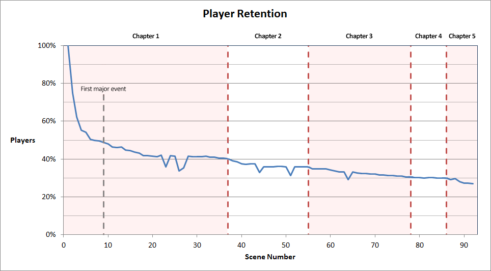
The Viewership Curve
This is a bit tangential, but I've seen curves shaped like this on my small personal YouTube channel. One video went viral and got many views, but 37% of people dropped within the first 30 seconds, and the retention stabilized at the 40% mark. YouTube assures me this is typical. Other videos had just a tiny fraction of the views, but the retention stabilized at the 60% mark. My guess is that since the channel is unknown, people who clicked the viral video had no attachment to it, but those who viewed the lesser known videos specifically wanted to see more content once they gained familiarity with my style.
I believe something similar is happening here. The Sekimeiya is an unknown game by an unknown developer, so many people played out of curiosity. I assume if a future title is made by Trinitite Team, the drop will be much less pronounced since players will know what to expect and will self-select more strongly.
Sample Cohorts
In order to make more sense of later data, the sample is divided into three cohorts. People with 1 to 2 scenes played less than 30 minutes, but they make up 36% of users. Since people who drop this early will likely use default settings, their results are charted separately to reveal more of the actual user preferences. Players who complete the game are also treated separately.
| Cohort | Percentage | Description |
|---|---|---|
| 1-2 scenes | 36% | Played 1 to 2 scenes |
| 3+ scenes | 37% | Played at least 3 scenes, but didn't finish the game |
| Finished | 27% | Finished the game |
1.2 Hours per Session
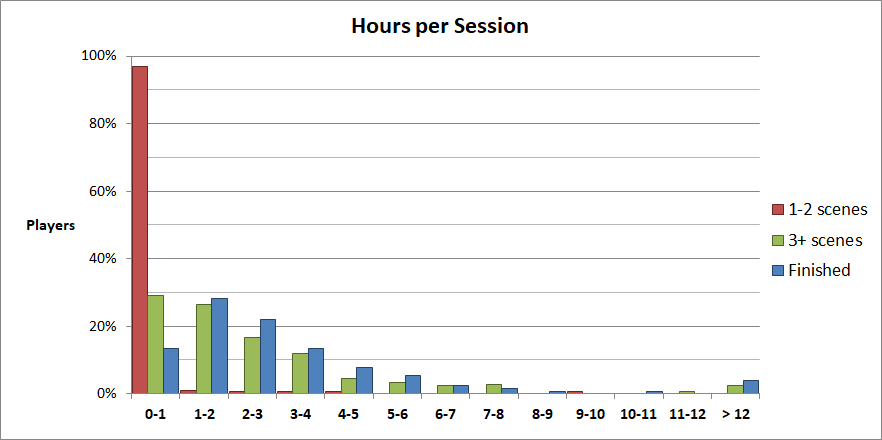
The chart below shows the average time a player would spend in a single session. Only time spent when the game was focused (ie. in the foreground) was counted. While it's very possible for players to be idling with the game active, this measure should be fairly robust.
Unsurprisingly, people who weren't interested in the game didn't spend much time on it. People who were invested were more likely to spend 1-2 hours per session, and the numbers fall off from there.
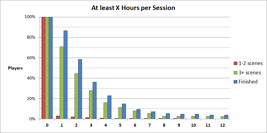
To gain a deeper appreciation for the data, we also graph the minimum number of hours a player will spend per session on average. Roughly 50% of invested players spend at least 2 hours playing, but fewer than 10% of people played longer than 6 hours.
The writing style in the game is dense and requires the player to actively parse it. The drop past 2 hours may be influenced by cognitive fatigue, but there's no way to confirm. A different writing style or genre may have users engaged for longer periods of time.
1.3 Fullscreen
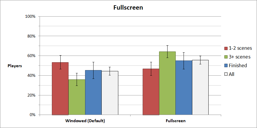
This is the preference that shocked us the most. The members of our development team tend to play their VNs in windowed mode, so we designed the game as such. Turns out a slight majority (55%) of players prefer fullscreen.
We didn't include a quit button on the main menu, so players using fullscreen had no clean way to exit the game. They either had to Alt-F4 or un-fullscreen the game, neither of which were good from a user perspective. Make sure you have a quit button on the main menu.
1.4 Aspect Ratio
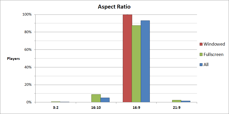
Windowed mode is forced to have an aspect ratio of 16:9, but even without that restriction, nearly 90% of players have 16:9 monitors.
1.5 Resolutions
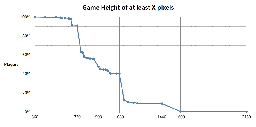
We designed the game for 1280x720 assuming it was the industry standard. The engine we built the game in (Ren'Py) doesn't scale graceful to multiple resolutions, so we chose a resolution that we thought was a good midpoint that can scale up and down.
Turns out it was a fairly reasonable assumption, but still not optimal. 10% of people played with a width narrower than 1280 pixels, and another 10% played with a width wider than 1920 pixels. However, if we were to make the game today, we would build the game natively for 1080p. Screens are getting bigger, not smaller, and scaling down is much easier than scaling up

2. Text and Textbox
2.1 Textbox Frame
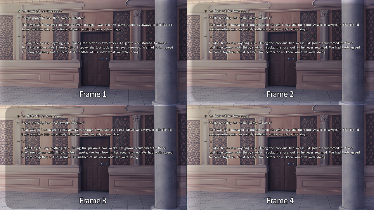
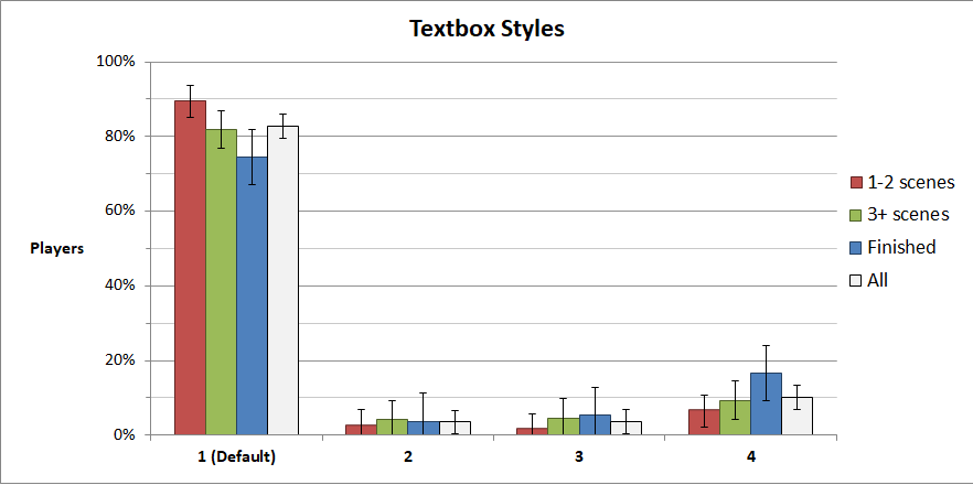
We gave players the option to change the textbox frame. All have the same colors and the opacity is controlled by players, the only difference is the edges.
- Frame 1 - Covers the entire screen, has very subtle fade on the edges (default)
- Frame 2 - Defined box with fuzzy edges
- Frame 3 - Defined box with sharp edges
- Frame 4 - Covers entire screen, fades out on the left and right. Ren'Py default.
Most people kept the default setting, but a sizable number switched to Frame 4. The implication is most people like smooth fade on NVL textboxes rather than ones with sharp edges
2.2 Textbox Width
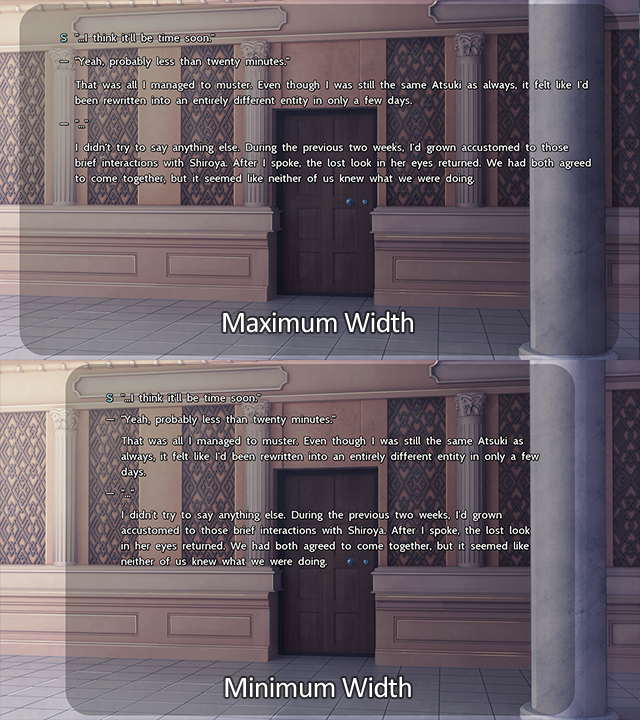
This feature was added because we thought people would vary textbox width so their eyes don't wander as much.
95% of players kept it at the widest width (default), and only 1% used the narrowest mode. The implication is people don't really care strongly.
2.3 Textbox Opacity
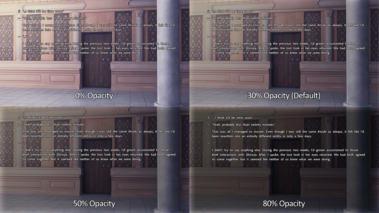
Opacity determines how transparent the textbox should be. This helps separate the text from the graphics beneath it. Since the text covers the entire screen in NVL, it's very important for players to be able to read on a variety of backgrounds. Players had a slider where they could adjust the opacity from any value between 0% and 100%. The maximum opacity used by any player (80%) is visualized below.
90% of players kept it at the default, and 6% of players made it less opaque. 4% made it darker.
2.4 Font Weight
Players could change the weight of the characters, making them thicker or thinner.
85% of people kept the default, 10% used a thinner font, and 5% made it thicker.


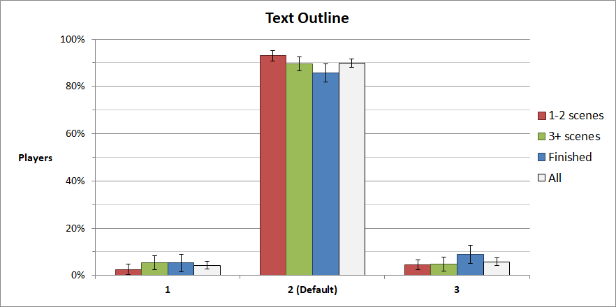
2.5 Text Outline
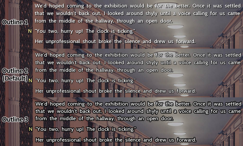
Another way to separate text from the background is with the text outline. This gives contrast to the text and helps it pop. The outline options we included were:
- Outline 1 - Subtle drop shadow
- Outline 2 - Thin outline (default)
- Outline 3 - Thick outline
90% of people were happy with the default, but about 5% wanted something stronger, 5% wanted something more subtle.
2.6 Text Speed
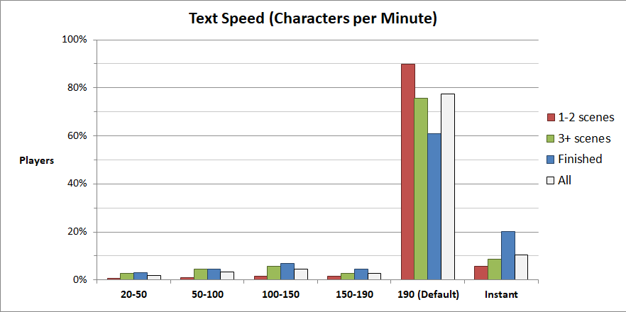
Players can control how quickly text appears on the screen using a slider. Text will appear one character at a time until the line is completed. By default, the setting is at the maximum value, but not instant. Instant text has a very slight fade when it appears to give it a more fluid feel.
The vast majority prefer to see letters typed out quickly, 10% prefer something slower, and 10-20% like text to appear instantly.
3. Dialog
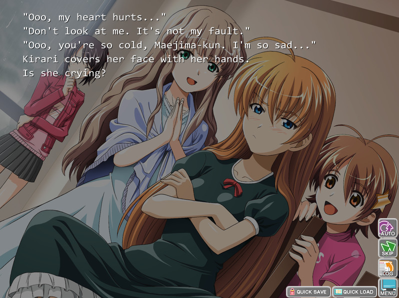
VNs that exclusively use NVL tend to obscure who is speaking and force the reader to determine it based on context. This can work if the number of characters in a scene is limited, visual cues are given, or the characters have a particular way of speaking, but it presents some difficulty if many characters are present at once.
Here we experimented with different ways of making the speaker easier to identify and break up the walls of text that NVL can produce.
Kira☆Kira

Fate/Stay Night
3.1 Speaker Indicator
Speakers can be indicated with either a symbol or nothing at all. The symbol (on by default) is a single character long and is usually the first letter of the speaker's name. For example, we have I = Isla, K = Katei, and A = Akaro. However, some characters are indicated with special characters to avoid conflicts. For example, S = Shiroya, but Sai is Ψ, the Greek letter "psi". A little playful, but easy to recall.
We briefly considered using the names of the characters as indicators, but this fell through for many reasons. Since we we're giving players so many choices for formatting text, it was possible for text to overflow. The names are of differing lengths would look pretty ugly on the side. It also clutters the screen somewhat.
Nearly 100% of players used the symbolic indicator rather than inferring it from the dialog and sprites.

3.2 Colored Speaker
A splash of color can be added to the indicators to make them a bit more distinct. Colors are on by default. The example here isn't the best, but it appears much clearer in-game.
Again, nearly 100% of players kept color on.

3.3 Colored Text
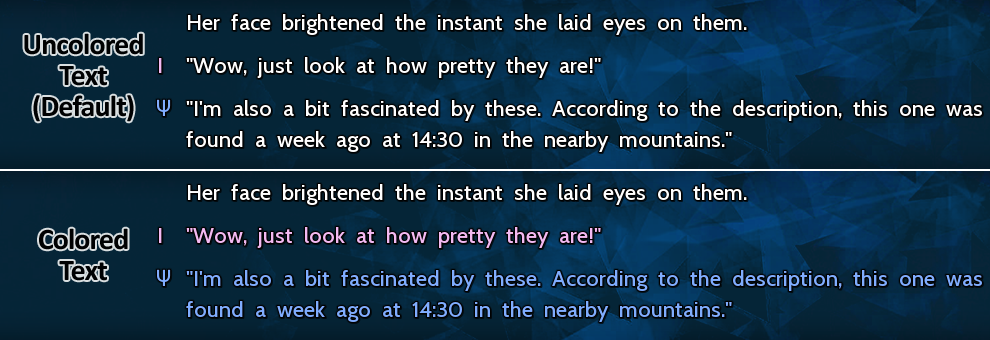
In addition to colored indicators, players can color the entire line of text with the same color as the indicator.
By default, this is off, but 40% of users toggled it on. There's a case to be made about having colored text on by the default. In an ideal world, we would have given players the ability to change text color with some RGB or HSV sliders.

4. Other Features
4.1 Mute if Unfocused
In some VNs, music and sounds are automatically muted if the game is unfocused and put into the background, and in others, the audio continues to play. However, I've always preferred to have it mute when I switch tasks. This setting is usually hardcoded into the engine, I had to modify Ren'Py to make it work.
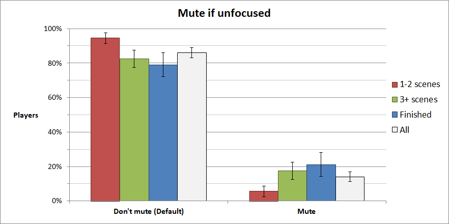
Given the choice, 20% of players would actively prefer to mute the game if it's not focused.
4.2 Click through pauses
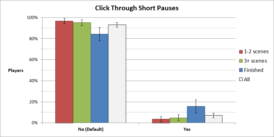
This setting is a bit experimental. We decided to control the pace of the game by having short pauses in the game, and any pause less than 3 seconds long was a hard pause by default. That means that the player cannot click through them.
People were more likely to turn off hard pauses the more they played, with around 15% choosing to regain control. My takeaway from this is don't unnecessarily remove player control, but people are willing to accept it if it's not excessive.
4.3 Skip Unseen Text
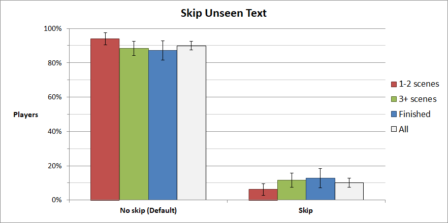
10% of readers are willing to skip through unread text. A brief discussion with players revealed that they skip if:
- The scene is uninteresting, drags on too long, or an annoying character speaks too long. In these cases, players will open the backlog if they skip too much
- The game crashes and players want to quickly catch up
- Some didn't know about "click through short pauses" and used this setting to bypass it
5. Features Specific to The Sekimeiya
5.1 Minimap
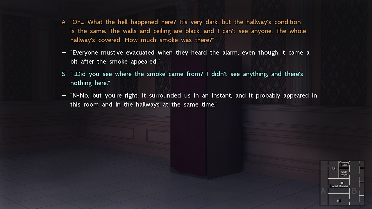
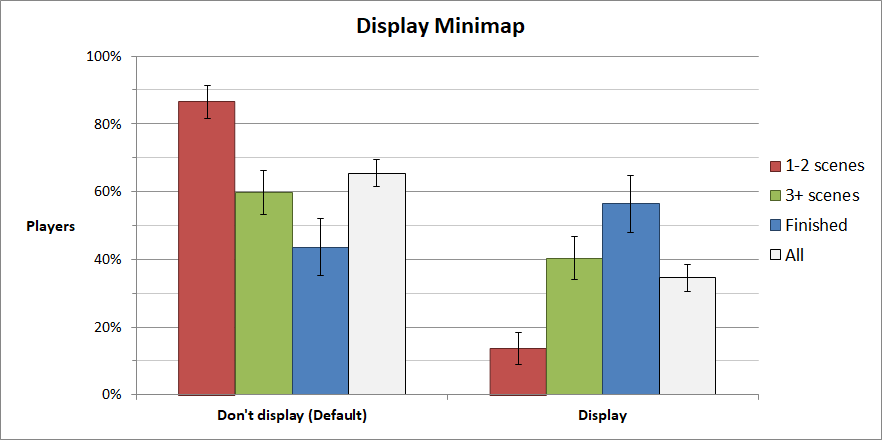
In this game, people are trapped in a closed space and move through it constantly. The main character's location and motion is important, so a map is included in the menu with a small indicator showing where you are at the moment. This map is unlocked once the characters find it in-game
In addition to that, players have the option to show a minimap centered around the main character in the bottom right hand corner. This position was chosen since text is least likely to cover it.
We found that players who finished overwhelmingly chose to activate it. I'd strongly suggest considering such a feature in your game if it's suitable. Give players the tools to immerse themselves and feel situated in the world.
5.2 Time Format
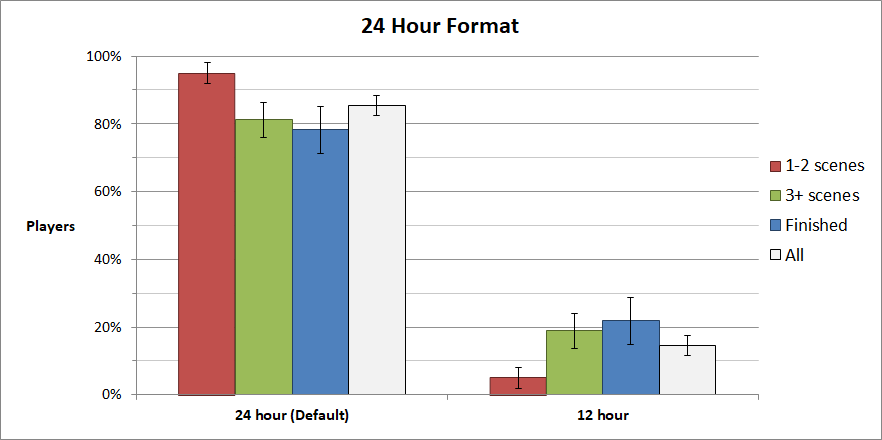
This was a fun one. Keeping track of times and events is pretty key, so we chose to use 24 hour times by default to avoid any ambiguity.
| 12 Hour | 24 Hour |
|---|---|
| 9:45 a.m. | 09:45 |
| 9:45 p.m. | 21:45 |
80% of people didn't mind using 24 hour notation, but around 20% switched to using 12 hours. Users of 12 hour notation mainly came from the English-speaking world. The following shows the percentages of users from each country who played at least 3 scenes and switched to 12 hour notation:
- United States of America (40%, N=136)
- Australia (33%, N=12)
- Canada (20%, N=22)
- Great Britain (13%, N=23)
There's likely an element of comfort and familiarity involved, but people were still more flexible than I imagined.
Conclusions
There are a few important takeaways here:
- Don't assume that users will play with the same settings as you. You're designing a game for others, not yourself.
- Most settings will be kept at their default value, so consider what the typical experience should be.
- Make sure the reader can clearly read the text, know who is speaking at a glance, and visualize where events are happening. Reduce the barriers to reading.
- Don't be afraid to experiment with new features if you think they're useful.
That was quite a few settings to go through, and there's still a few more to explore. In the future, I may update this article or create another article addressing them.
If you've got any comments or questions, post them down below. Thanks for reading, and I hope you learned something!
Files
Get The Sekimeiya: Spun Glass
The Sekimeiya: Spun Glass
A mystery thriller visual novel featuring line search and jump functions.
| Status | Released |
| Author | Trinitite Team |
| Genre | Visual Novel, Adventure |
| Tags | Anime, Atmospheric, Detective, Mystery, Singleplayer |
| Languages | English |
| Accessibility | Configurable controls |

Comments
Log in with itch.io to leave a comment.
Thanks for the insight. Very helpful. I'm looking forward this game to be ported into Switch or Android for better experience (don't really like playing VN in PC nowadays)
this is very useful :O i love it when devs share their data like this! i don't make vns, but this will be useful for my decisions in my games too :D
Thanks so much for all the data and analysis. It'll definitely help me drive some of the UX decisions for my own projects.